- OVERVIEW
Project Overview
Making clean nutrition feel simple, honest, and enjoyable.
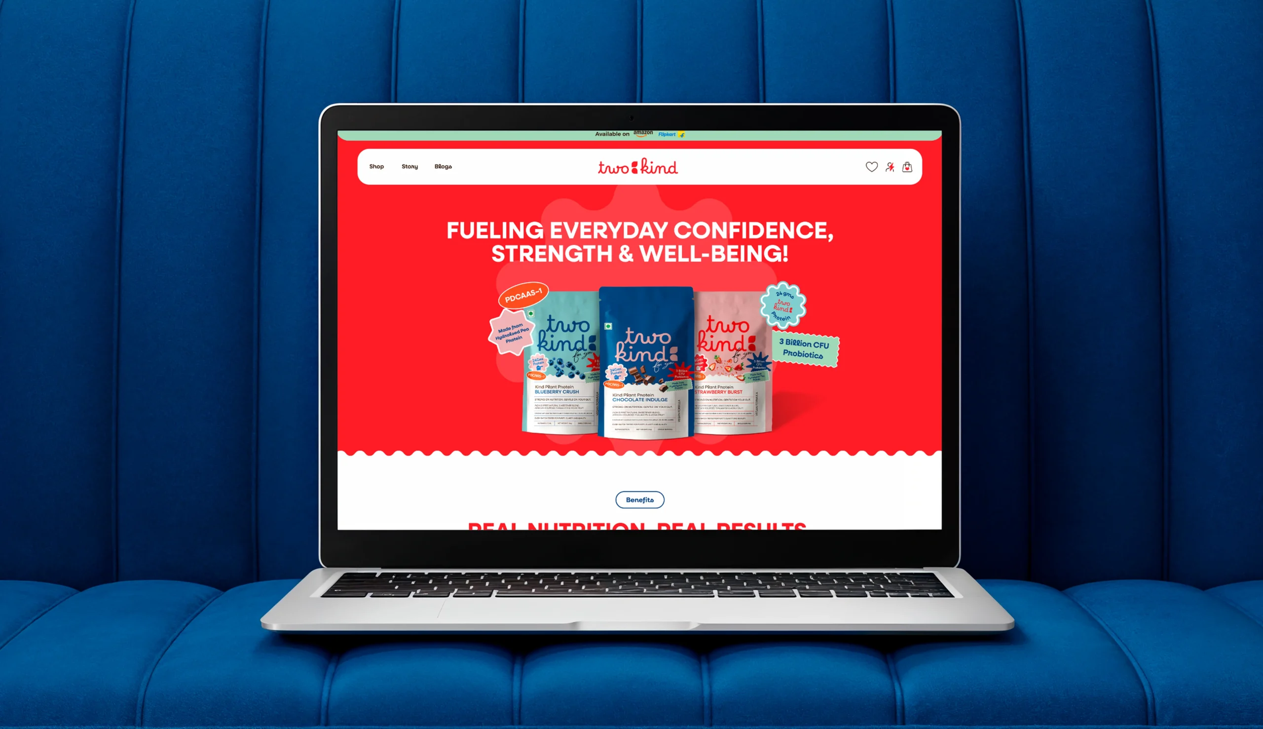
TwoKind came from a simple gap in the wellness market: finding nutrition that balances clean ingredients, great taste, and everyday usability. The brand focuses on plant-based protein that is easy on the gut, transparent in its formulation, and designed to fit naturally into daily routines.
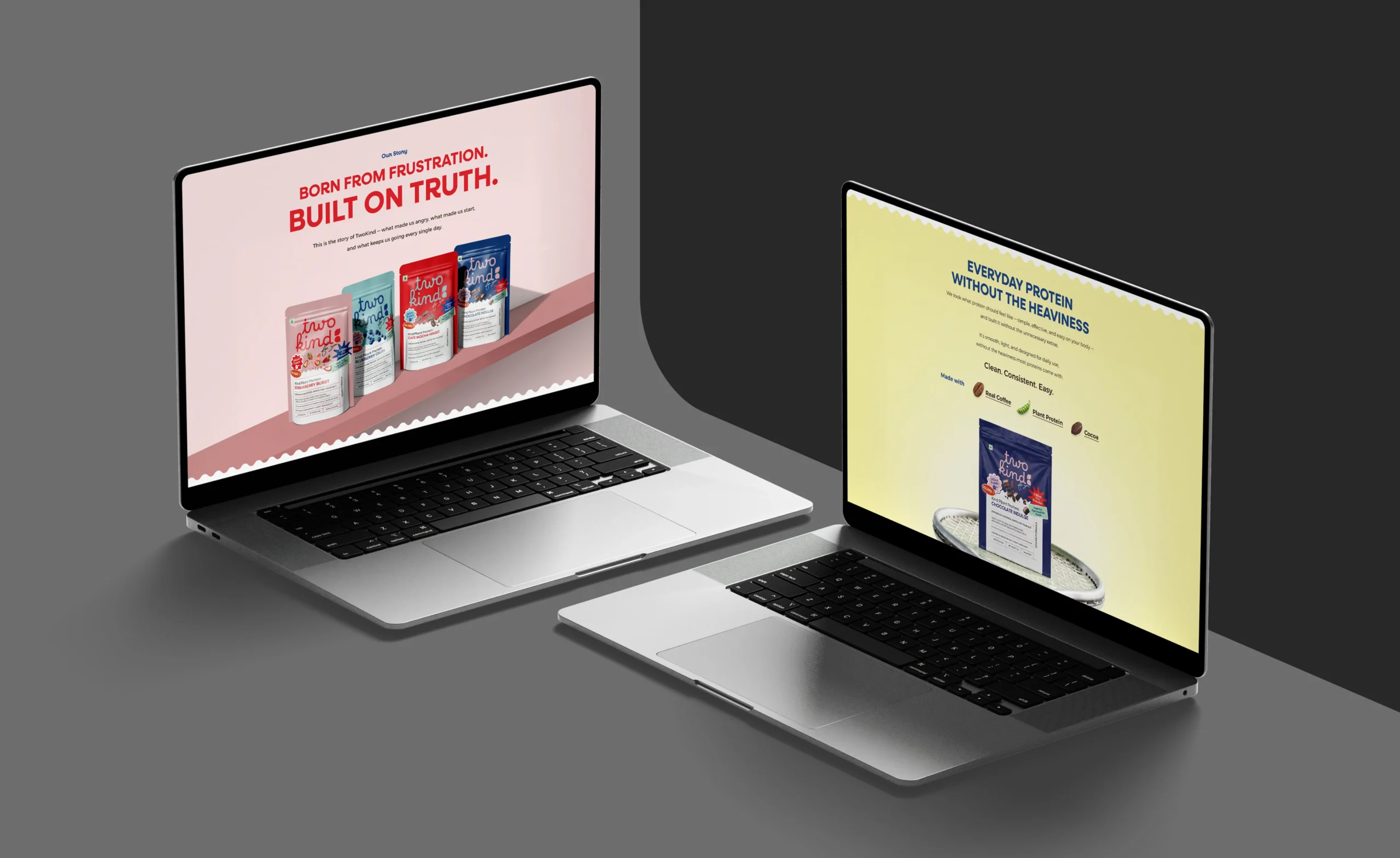
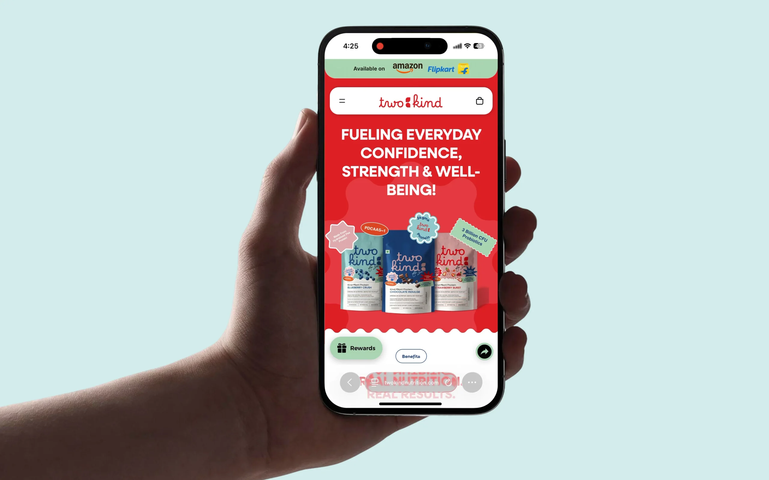
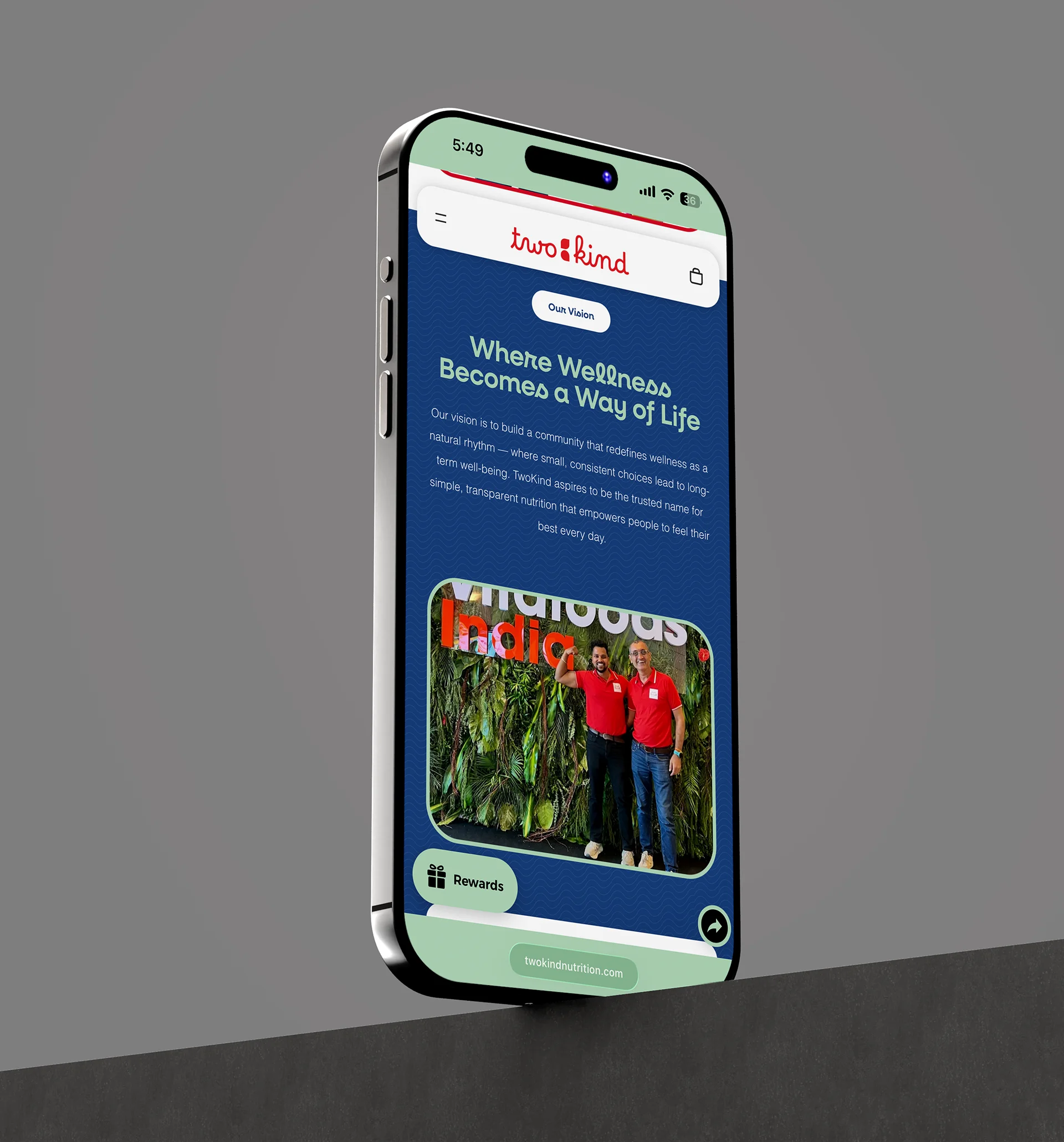
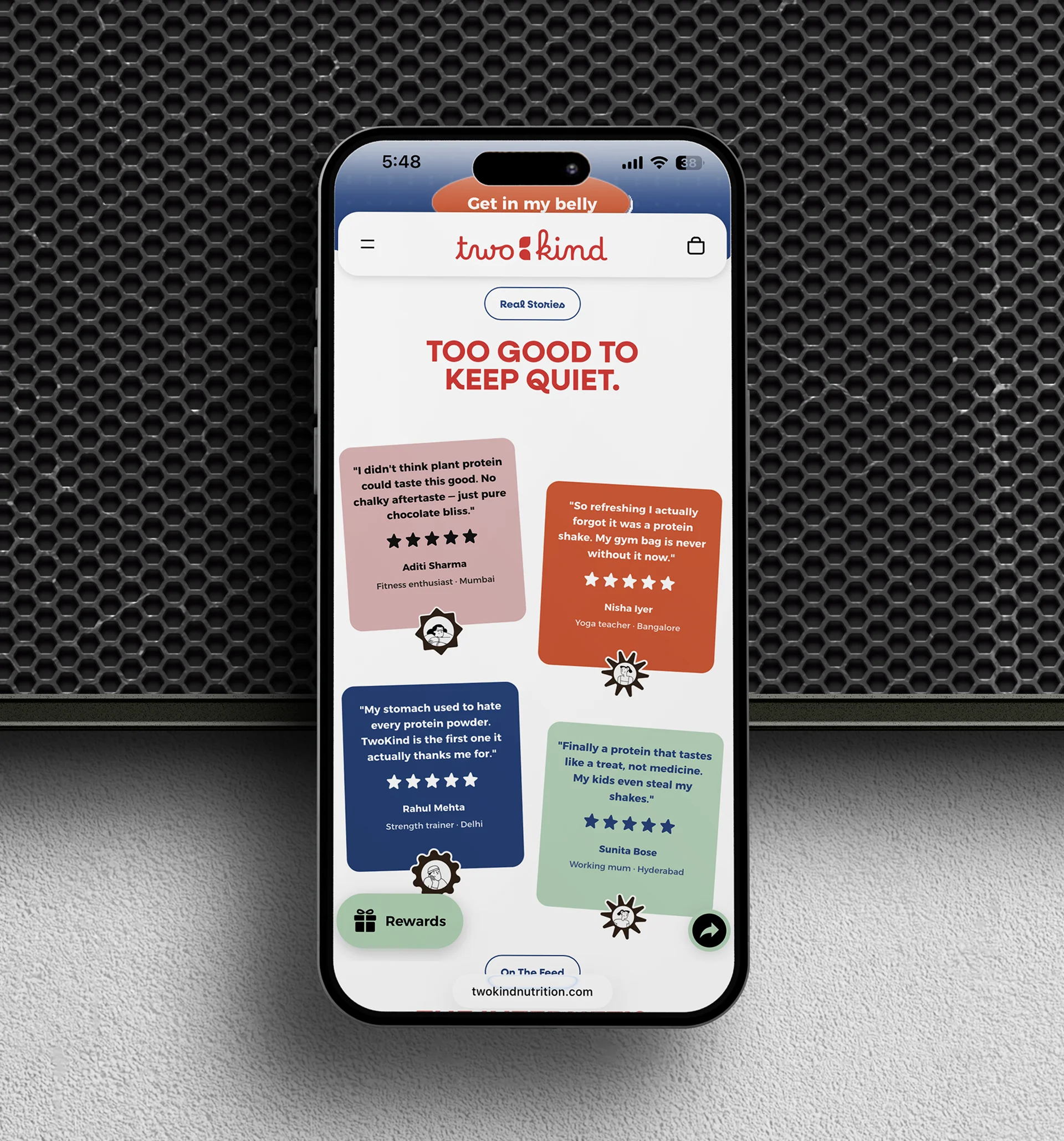
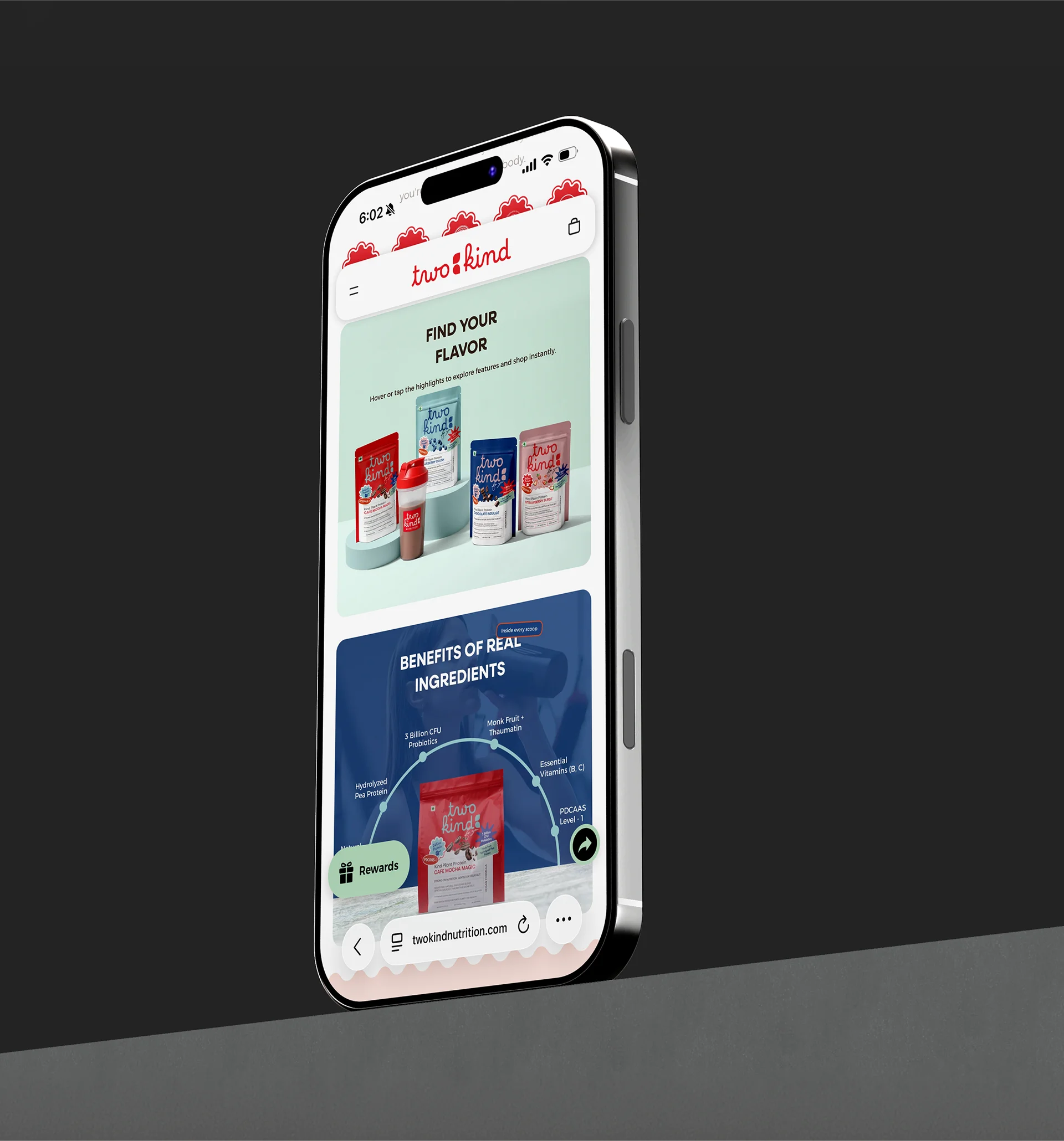
We translated that philosophy into a digital experience that feels fresh, approachable, and product-led while making the shopping journey easy to understand.
INDUSTRY
Nutrition / Wellness
Year
2026
TYPE
Ecommerce
Link
Visit Website →
2. VISUAL IDENTITY
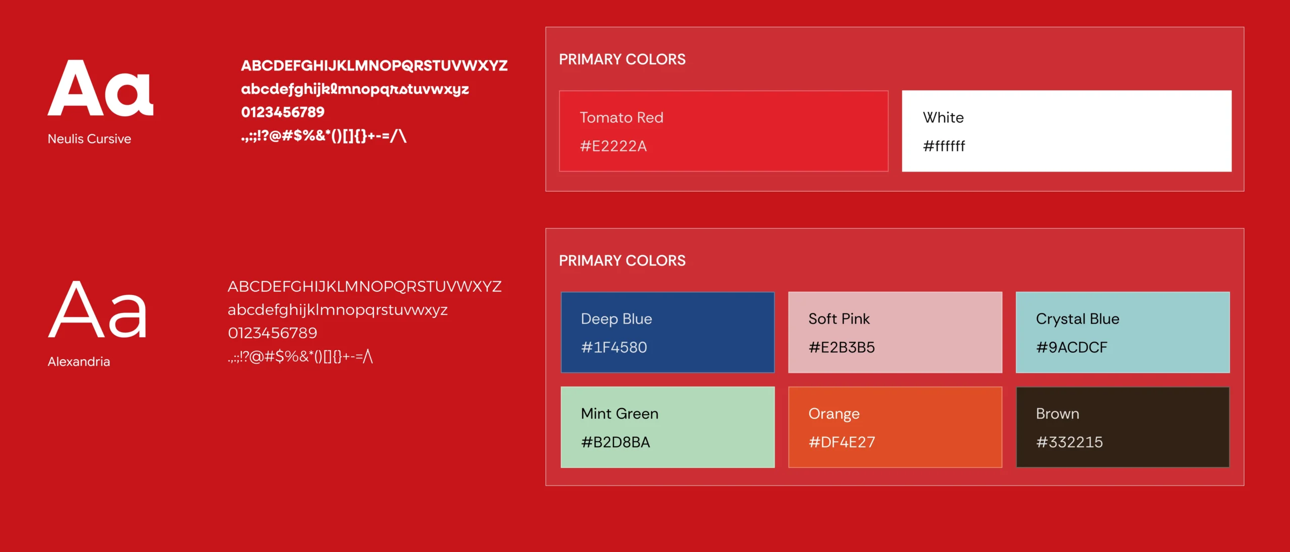
TYPOGRAPHY & COLORS
4. design process
behind the project
3. Showcase
home
5.Challenge
Making protein feel less complicated.
Protein brands often communicate through technical specifications, performance claims, and heavy fitness aesthetics. TwoKind needed a digital presence that could communicate its clean, plant-based approach while feeling approachable, trustworthy, and enjoyable.
The challenge was to balance nutrition, flavour, trust, and personality without overwhelming users with information.

6. Solution
Real nutrition. Made easier to choose.
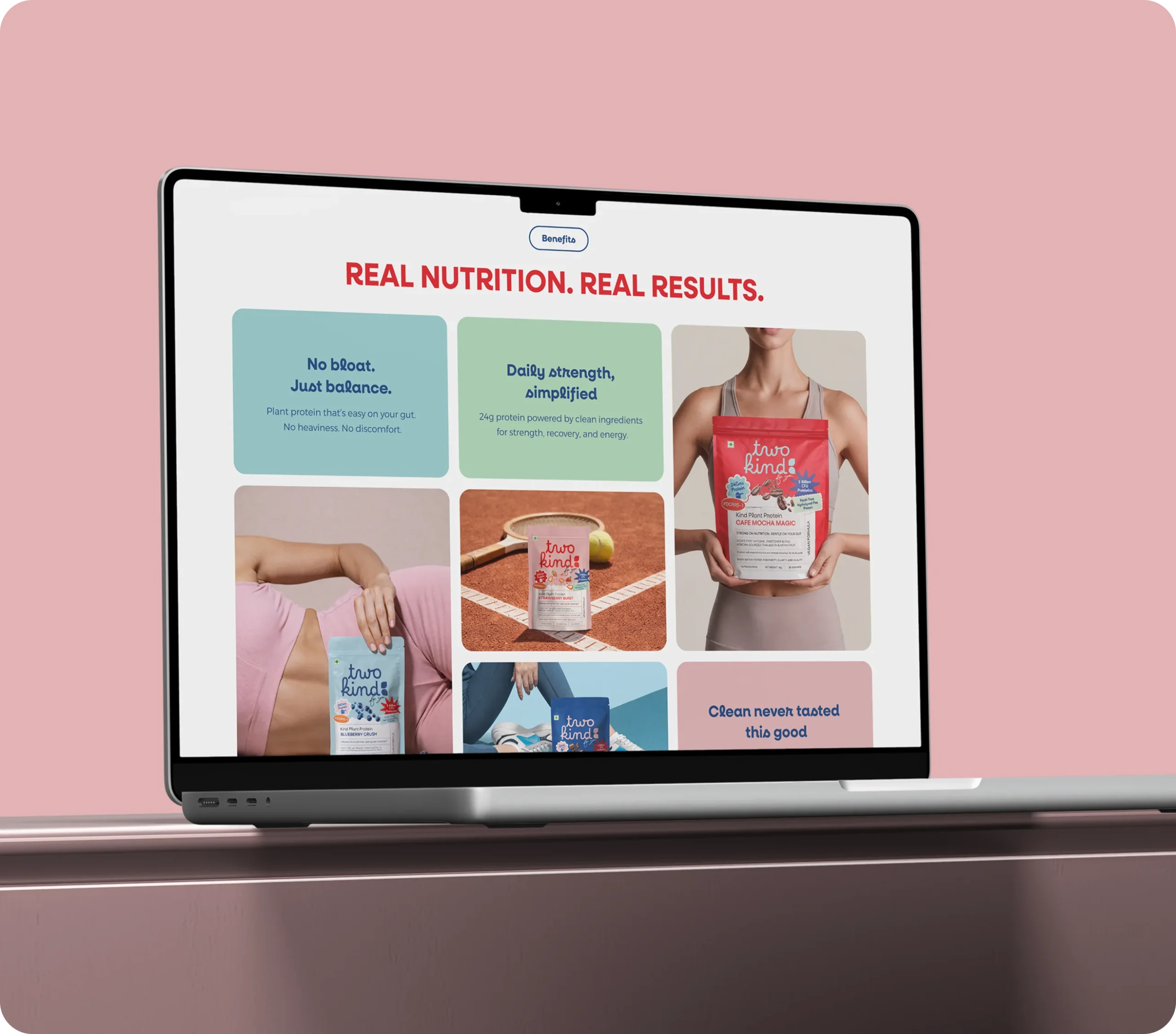
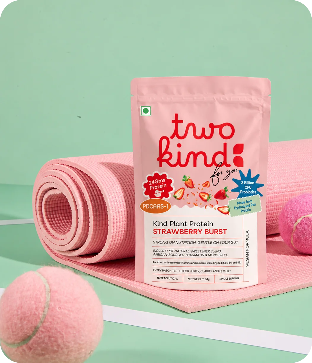
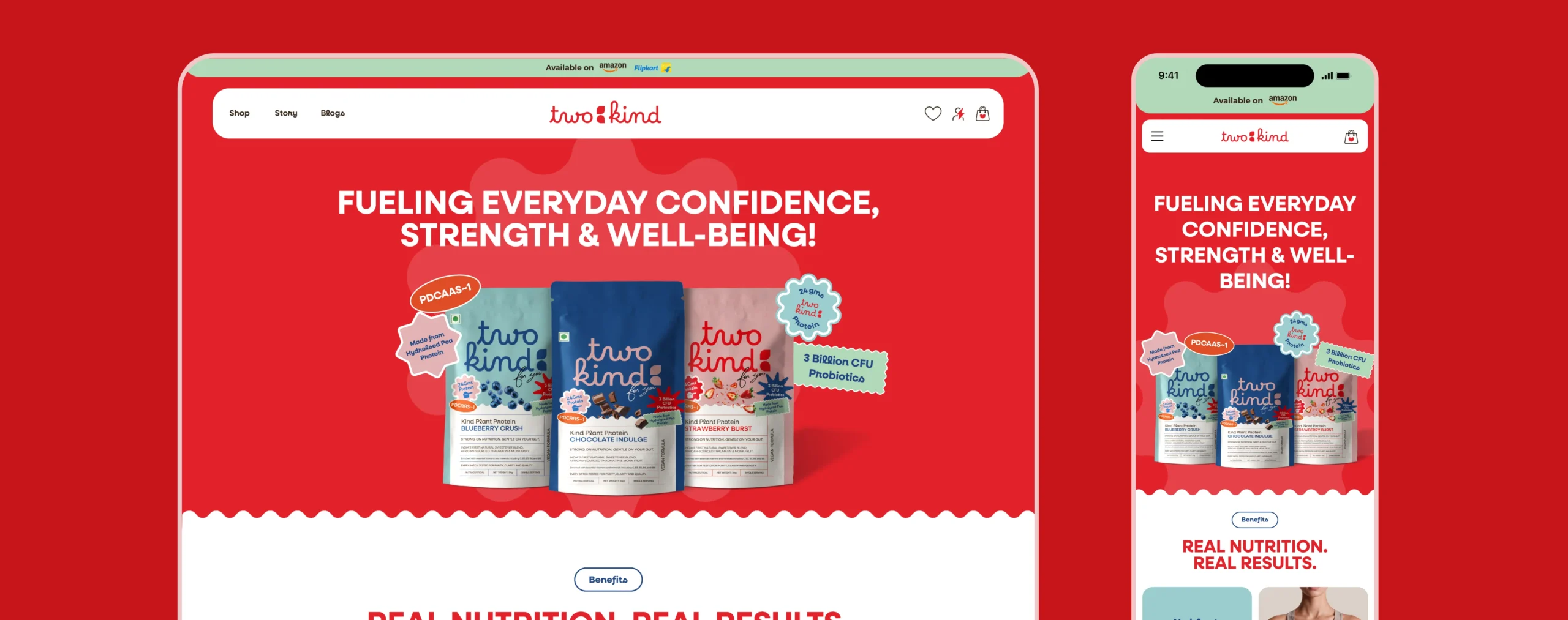
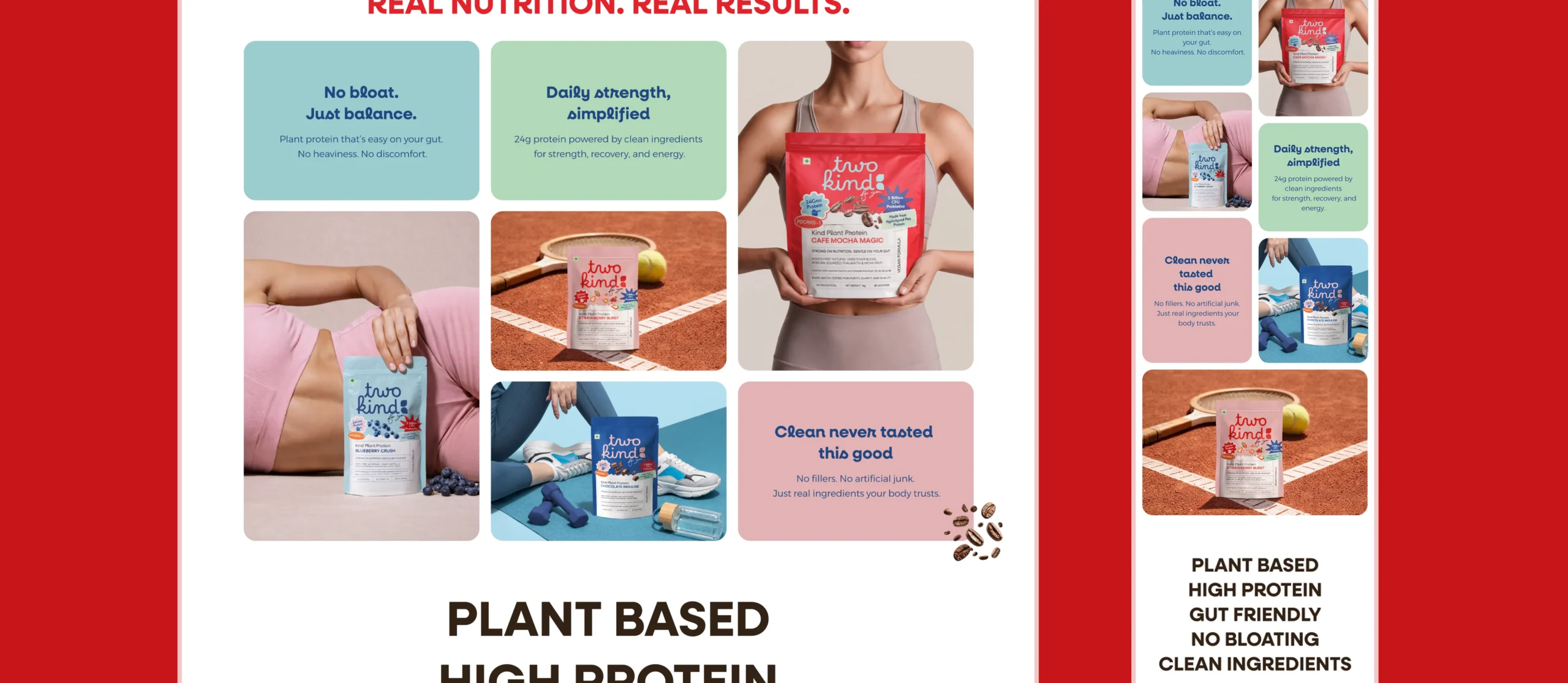
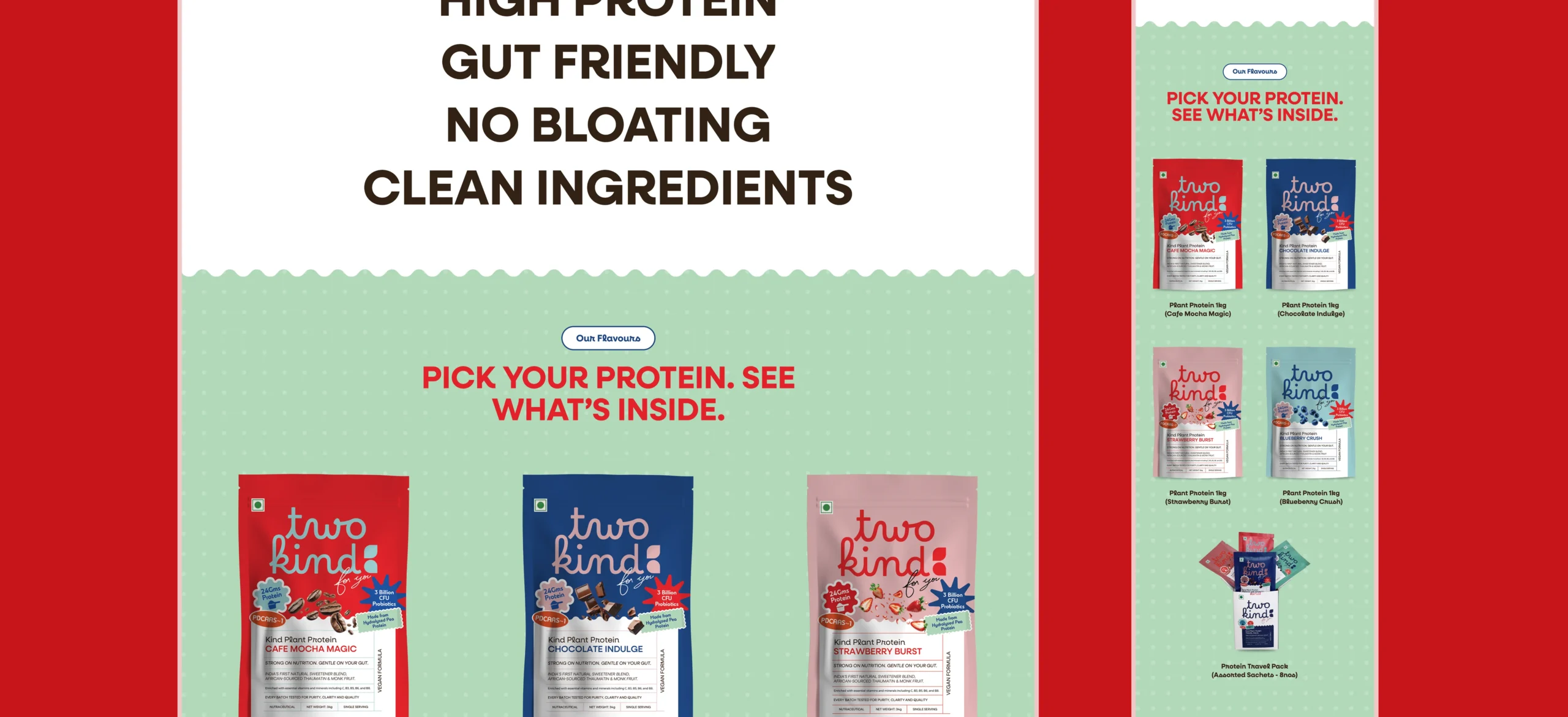
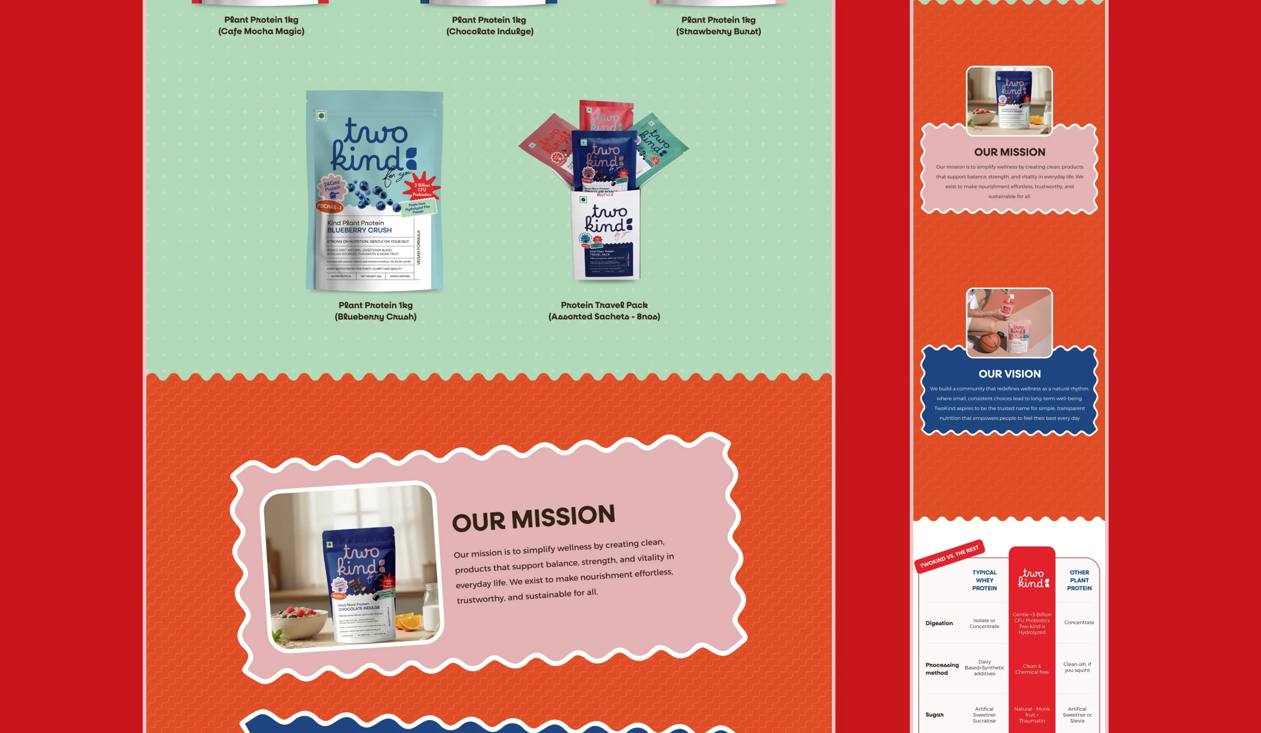
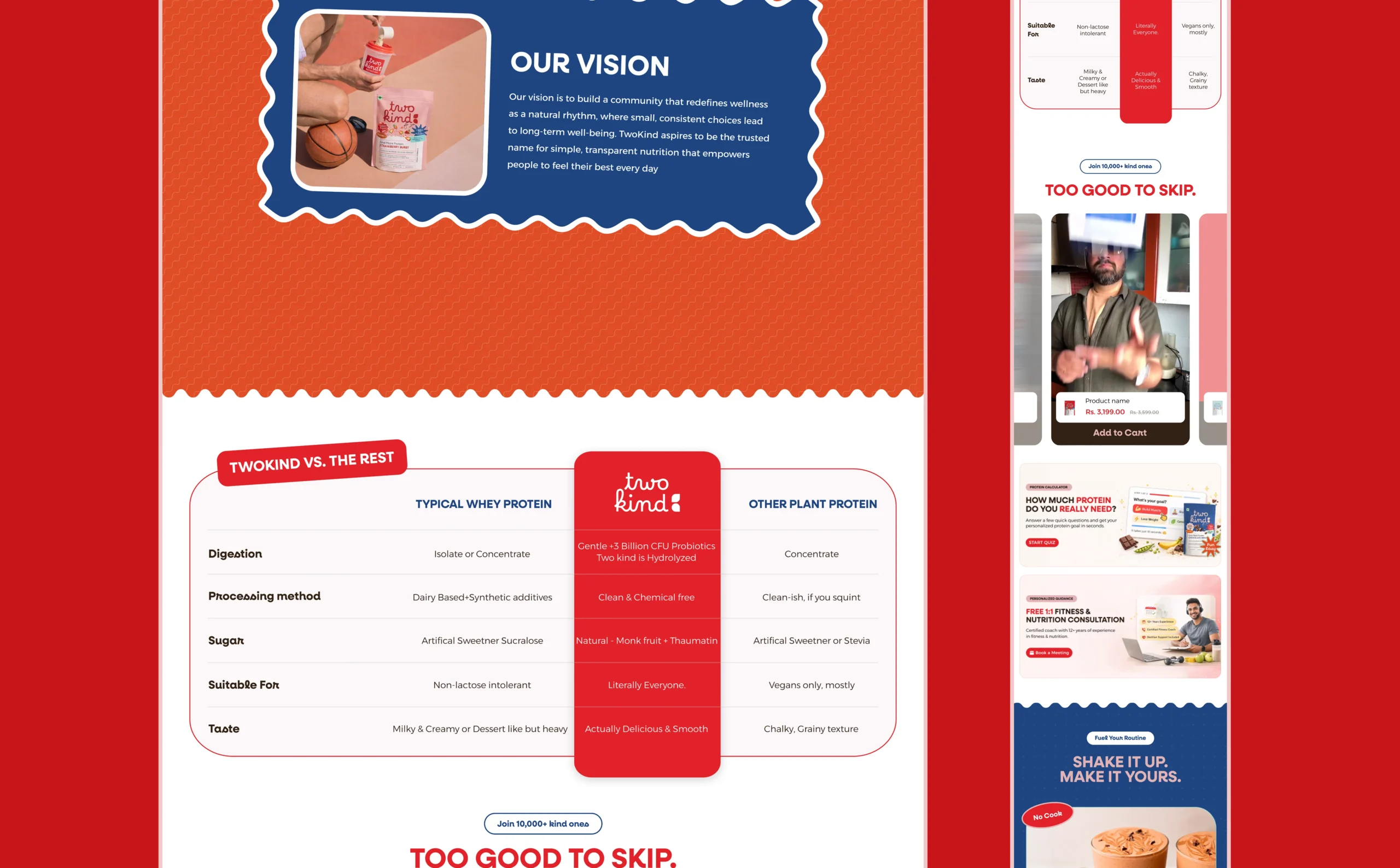
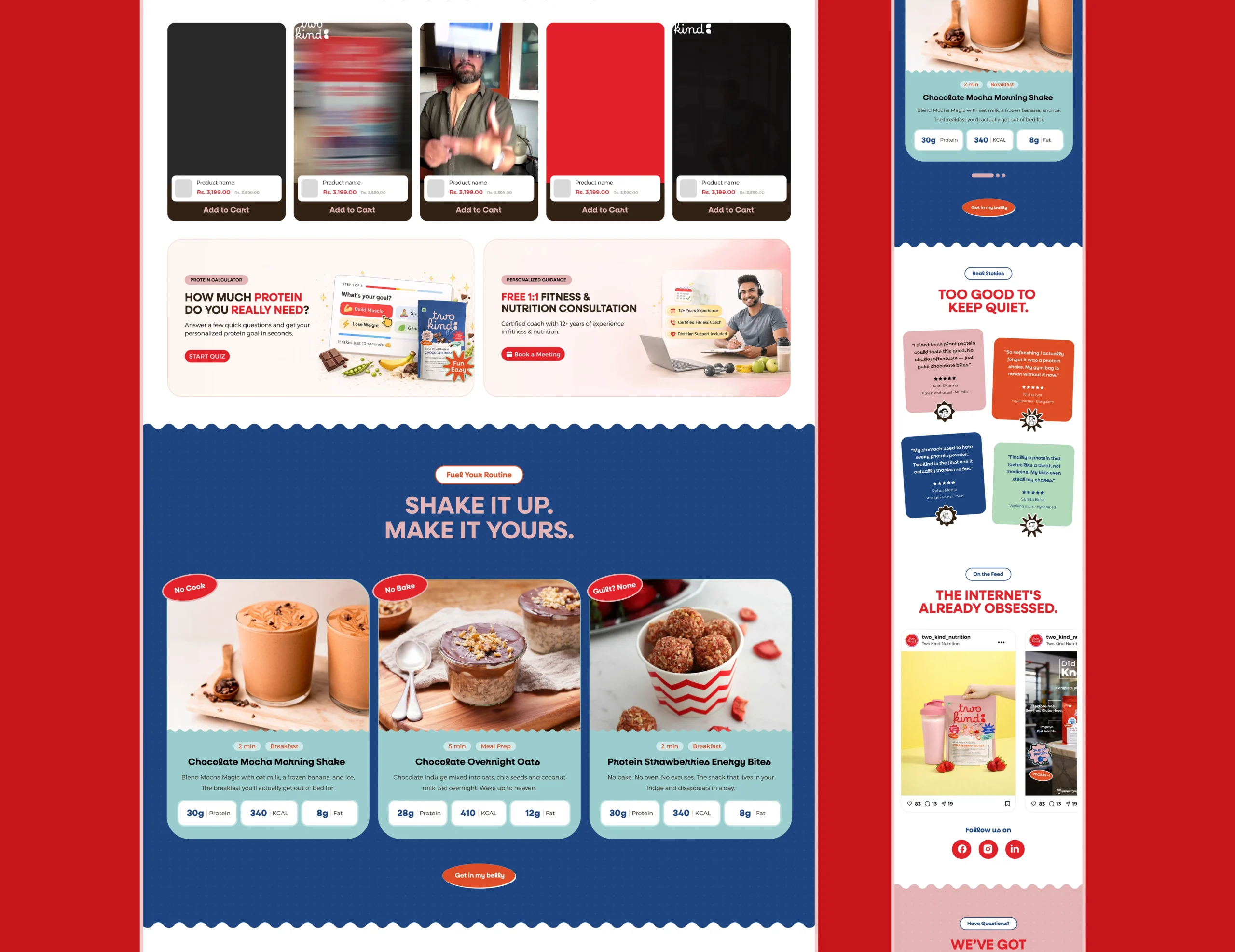
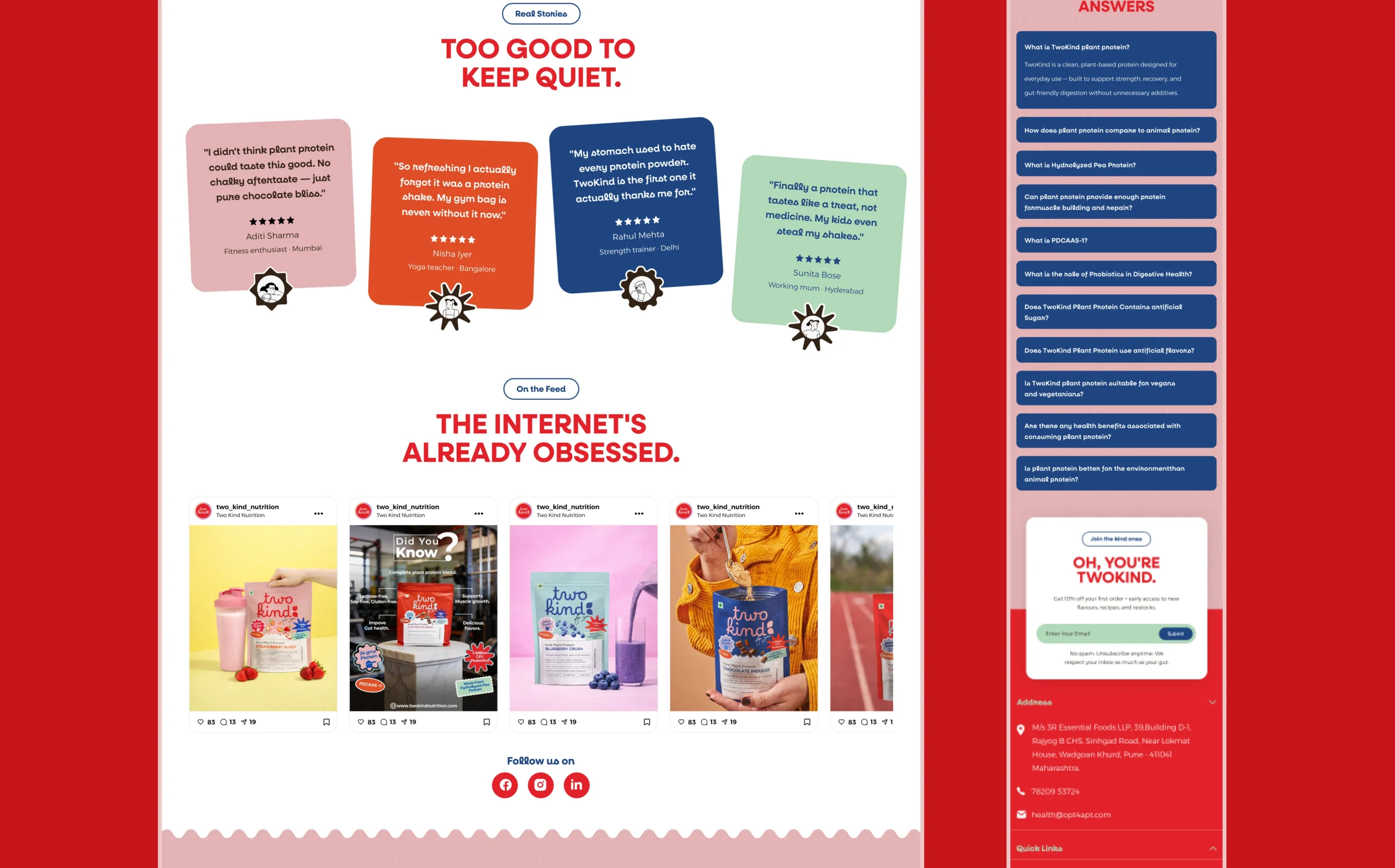
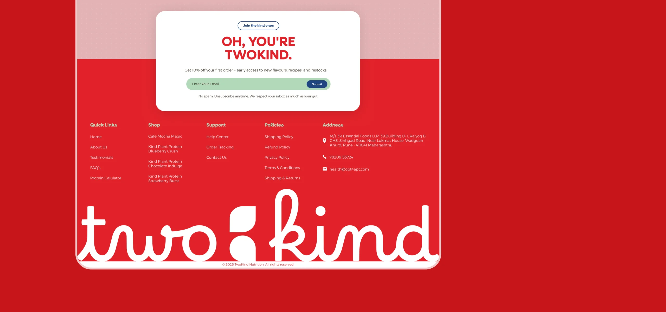
We created a playful, product-first e-commerce experience that combines expressive typography, bold flavour-led colours, ingredient storytelling, and clear product information.
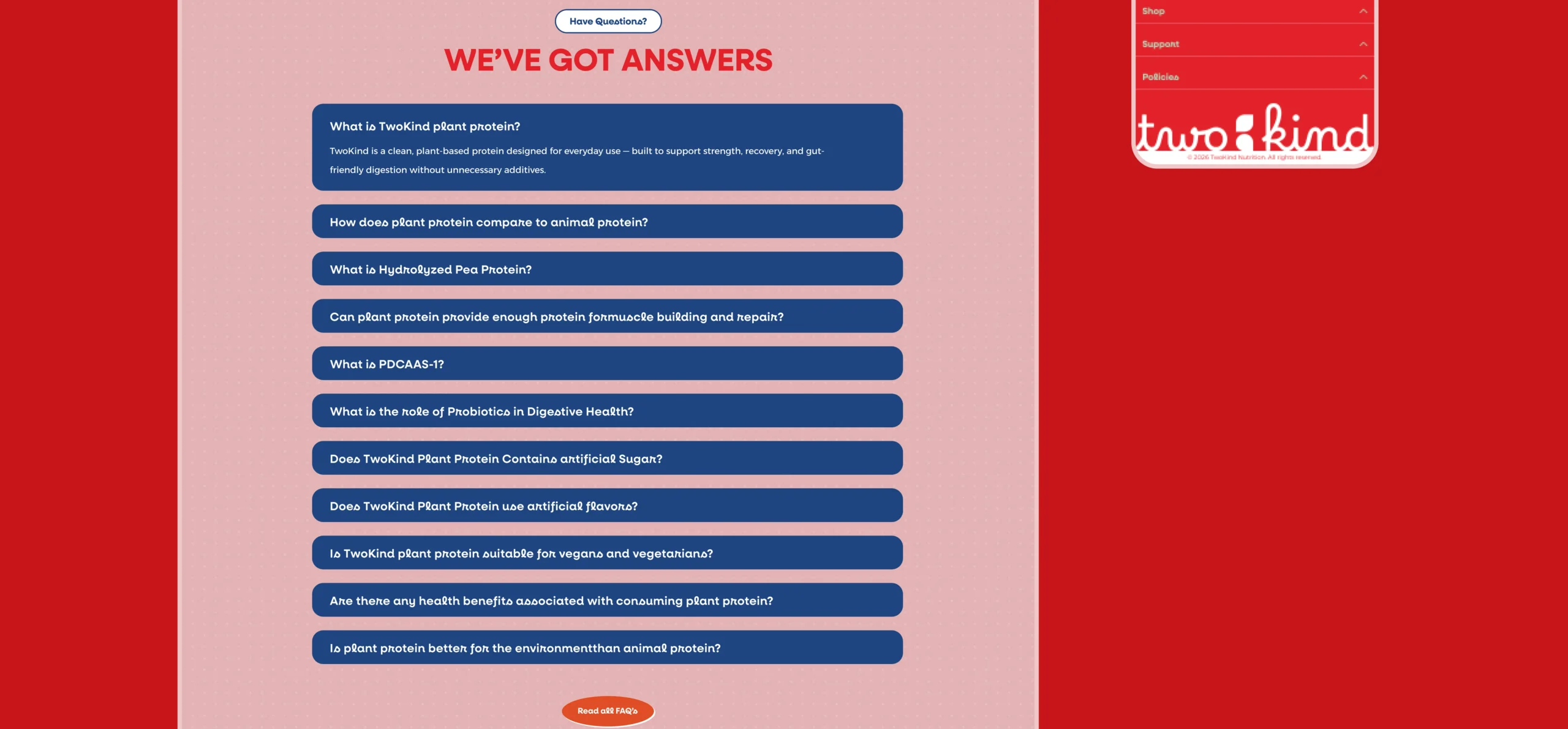
The design makes complex nutrition feel more approachable while keeping the shopping journey simple from first impression to checkout.
7. full design
desktop and mobile version